# Why I Switched from Safari to Arc: A Game-Changer in Browsing
Written on
Chapter 1: The Transition from Safari
The moment has arrived for a significant change in my web browsing habits.

Anyone familiar with my preferences knows that I have always been a fan of Safari. Its simplicity, speed, and user-friendly design have always appealed to me. Apple claims it’s the fastest browser for Mac, and I wholeheartedly agree.
In contrast, Google Chrome has never been my favorite. Firefox feels outdated, and I would steer clear of Microsoft Edge regardless of the encouragement to try it. Opera... well, let's just say it's not my first choice. Brave didn’t impress me either, despite the numerous recommendations.
However, there’s a new contender on the scene: Arc.
Developed by The Browser Company, Arc is still in its developmental phase. I’ve been testing it through an early-access program available for students this month, and it has the potential to be the most remarkable web browser I've ever encountered.
Here are the standout features.
Aesthetic Appeal
Arc’s design is visually striking. Upon opening, users encounter a refreshing interface that sets a pleasant tone.

The browser promotes itself as a “new web experience.” Many browsers, including Chrome, Firefox, and Edge, often feel cluttered and overwhelming. In contrast, Arc’s clean aesthetics are one of its strongest points, especially since it aims to attract Mac users who typically favor Safari and Chrome.
Initially, navigating Arc might take a moment, but once you acclimate to its layout, it’s a fantastic experience.
Bookmarks and Spaces
While all browsers offer bookmarks, Arc approaches this feature uniquely with both “pinned” tabs and favorites.
Favorites are showcased at the top, with pinned tabs just below them, while anything else falls under the “today” tabs section.
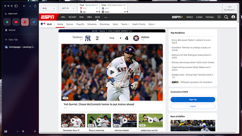
Let’s look at an example. Imagine I want to check the score of the Yankees vs. Astros game during the American League Championship Series. I would start by opening ESPN and navigating to the MLB section.

In this view, I have four primary bookmarks lined up: Google Drive, YouTube, ESPN, and Twitter. ESPN serves as my bookmark.
Next, I might want to read a recap from the Houston Chronicle for localized coverage. I would simply open a new tab beneath my bookmarks.
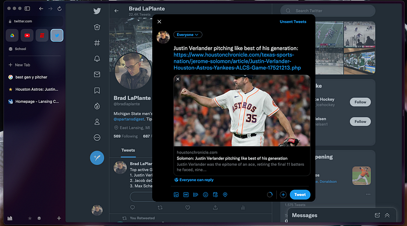
I found an excellent article about Justin Verlander, who I’m a huge fan of.

If I want to share this with my followers on Twitter, I can easily access my Twitter bookmark and post the tweet.

Moreover, if I wish to check Verlander's stats post-game, I can return to my ESPN bookmark without losing my place. The browser keeps all bookmarks pre-loaded in the background, making load times virtually nonexistent.
Arc also introduces "Spaces," which allow users to organize tabs into groups. I use one for personal favorites, another for work, and a third for academic tasks. This organization boosts productivity immensely and is a game-changer for those with attention challenges.
Picture-in-Picture and Split View
Effortlessly switching between applications is a feature I cherish, especially with Apple devices. The universal keyboard and seamless screen transitions across macOS enhance my experience.
One feature that Safari lacks is Split View—though Arc has finally introduced this capability.

In the screenshot, I’m transferring data from Michigan State’s website to my spreadsheet. Previously, I would have to toggle between tabs constantly, but now it’s a breeze.
Additionally, Arc supports Picture-in-Picture, a feature that has gained popularity on mobile but is often overlooked on desktops.
For instance, if I'm watching a YouTube video while needing to access an assignment on D2L, I can do both seamlessly.

The video plays in a small window at the corner of my screen, allowing me to focus on my work without missing any content. You can adjust its position anywhere on your screen, which adds to the convenience.
Furthermore, when playing media in the browser, a small now-playing bar appears in the sidebar, enhancing the experience.
Although Arc operates on a Chromium base, it stands out as the best browser I’ve ever used. It also features a built-in note-taking app called Easel, which includes drawing tools, though I haven’t utilized it much, similar to how I didn’t engage with Quick Note in Safari.
Notably, Arc prioritizes user privacy by not tracking recent websites, refraining from selling data, and offering an integrated ad blocker. The Focus Mode can be activated by pressing Cmd+S, which hides the sidebar until you decide to bring it back.
While Arc is still in beta and has had its fair share of glitches—like losing favorites when accessed from multiple devices—I’m optimistic about its future.
In summary, this browser is nearing perfection—no critiques necessary.
Chapter 2: Exploring Arc's Potential
Video Description: A comparison between Safari and Chrome, exploring why one user decided to leave Google Chrome behind.
Video Description: A personal account of abandoning Google Chrome, highlighting the reasons for switching to alternative browsers.