Mastering Tableau: Key Concepts for Beginners
Written on
Understanding the Essentials of Tableau
If you're venturing into Tableau, there are three fundamental concepts you should grasp to ensure your learning journey is productive. Tableau Desktop is a powerful analytics and visualization tool that allows users to delve into, comprehend, and share their data insights. While getting started may seem straightforward, it’s easy to stumble initially.
The interface allows for intuitive dragging and dropping, creating charts almost effortlessly; however, this can lead to confusion. You might find yourself repeatedly undoing actions (using the Ctrl+Z shortcut for keyboard enthusiasts) and experiencing some frustration along the way.
Here are three core concepts that will help you navigate Tableau more smoothly:
1. Rows vs. Columns
In Tableau, the terms "Rows shelf" and "Columns shelf" are critical. When you drag a data field (referred to as a "pill") into either shelf, it will generate a visual representation.
Pay close attention to the icons in the shelves; the orientation of the small squares indicates how the data will be displayed.
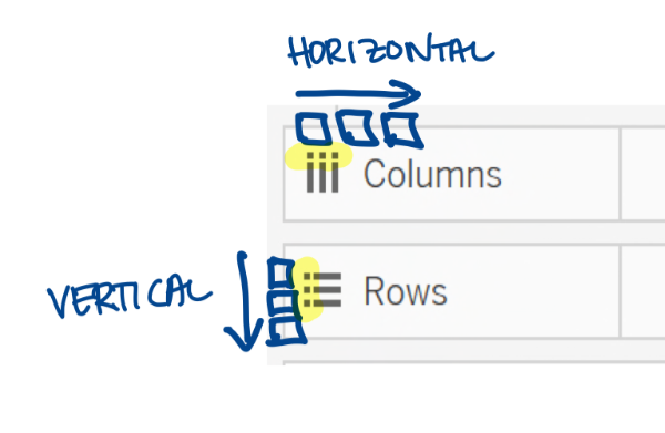
- Columns: Any field placed here is displayed horizontally, appearing side by side.
- Rows: Fields here are displayed vertically, stacked one above the other.
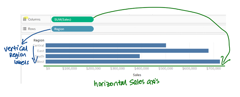
For instance, in a horizontal bar chart, you would place the Sales field in the Columns shelf to create bars. If you want the labels to stack vertically, they should go in the Rows shelf.
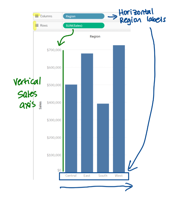
To create a vertical bar chart, you must switch the fields: place Sales in Rows and Region in Columns.
2. Dimensions vs. Measures
Understanding dimensions and measures is essential as they describe what the data signifies. Dimensions serve as descriptors that provide context, allowing you to break down measures effectively.
In Tableau, dimensions and measures are visually separated in the sidebar. A faint line distinguishes them. An important distinction is that measures are aggregated by default when dragged onto the canvas.
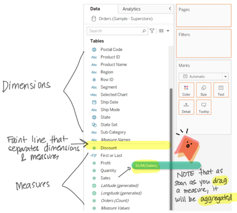
With the new data model introduced in version 2020.2, the explicit headings for Dimensions and Measures have been removed, though they remain evident when dragging fields between sections.
3. Blue vs. Green Fields
Lastly, understanding the significance of blue and green fields in Tableau is crucial. Blue fields represent discrete data, while green fields indicate continuous data.
According to the Oxford dictionary, "discrete" means “individually separate and distinct,” whereas "continuous" means “forming an unbroken whole; without interruption.” This distinction influences how data points are represented in your visualizations.
- Blue fields appear as headers or individual values.
- Green fields create continuous ranges or axes, displaying as horizontal or vertical axes when placed in the Columns or Rows shelf, respectively.
If placed in the Color property on the Marks card, green fields produce a gradient, and when used in the Filter shelf, they yield a range slider.
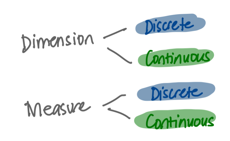
It's vital to note that the type of data (dimension or measure) does not directly correlate with blue or green. Many fields can be represented in either format, depending on how you wish to visualize the data.
If you’re eager to deepen your understanding, check out the following tutorial:
Tableau for Beginners: An In-Depth Guide for Everyone
This comprehensive video offers insights suitable for users of all roles, providing a thorough understanding of Tableau's capabilities.